Published on 17 min read
How to Sync a Design System with Claude Design
Syncing React components into Claude Design with /design-sync: what the mirror holds, how it's verified and a step-by-step example with shadcn/ui, Tailwind v4 and Storybook.
TL;DR
Syncing a design system with Claude Design creates a mirror: a compiled, self-rendering copy of the component library, so Claude designs with the real components. The sync runs with /design-sync from Claude Code and checks and fixes its own work before uploading, and the mirror is a one-way snapshot. With shadcn and Tailwind v4, the key steps are an entry file with type definitions, a compiled stylesheet with safelisted layout utilities, fonts listed in extraFonts and a conventions file. Storybook is optional, but it provides the reference that makes the sync verifiable.
AI design tools like Claude Design can turn a short prompt into a full screen in seconds and the first time it happens, it feels a bit like magic.
Once we look closer, we realize that these tools don't know our components, so they reinvent every one of them. Instead of our Button component, we get a new button with hand-picked classes that only look like ours:
// What the tool generates
<button className="px-4 py-2 rounded bg-blue-600 text-white">Save</button>

// What we expect
<Button>Save</Button>
Although it looks close enough to approve, it's far enough that a developer has to rebuild every piece of it.
In this article we'll answer the basic questions about syncing a design system with Claude Design - so it builds designs from our real components instead of reinventing them. Then we'll build a minimal design system with shadcn/ui, Tailwind v4 and Storybook from scratch and walk through syncing it step by step.
What Is Claude Design
Claude Design is Anthropic's design tool, built right into Claude. It turns a plain-language description (a prompt) into a design: a screen, a prototype, a slide deck or a one-pager.
We can ask for one in a regular Claude conversation, work on a canvas at claude.ai/design or create one from Claude Code using the /design command. Then we refine it by commenting on specific elements, editing text directly or asking Claude for changes.
What it doesn't know out of the box is our design system: the React components, the design tokens (colors/spacing/other named variables) and the typography already in our code.
So we need a way to hand it over and that's where the design sync comes in.
Understanding the Design Sync
The design sync takes the design system from our repo and hands it over to Claude Design. Before we build and sync something ourselves, let's figure out how it works.
The Mirror
Syncing a design system means creating a mirror of it inside Claude Design: a copy of our components that Claude can actually see and use. Once it's there, Claude builds screens from our real components instead of the generated lookalikes.
The important thing is that a mirror is only as good as its rendering. A component that ships without its stylesheet still arrives and Claude still "sees" a Button, but the Button is unstyled and every design built on it inherits the mistake.
So for every component, the real question is simple: does it look in Claude Design exactly like it looks in our product? We'll keep coming back to that question throughout the article.
What's Inside the Mirror
The mirror doesn't include our source files. It's a compiled version of the library: a single bundle with every component, plus the stylesheet, the fonts and a copy of React - so the components can run on their own.
Every component in the mirror also gets a small folder with its types (so Claude knows which props and variants exist), a standalone preview page (shown as a card in Claude Design) and a generated usage guide.
On top of that, the mirror carries a README with our own usage rules, which we'll write later on.
How the Sync Works
To create the mirror, we simply run a single command in Claude Code inside our repo:
/design-syncThis command builds everything we just described and uploads it to Claude Design (after we approve it). The command reads its settings from a .design-sync/ folder in the repo, which we'll set up in the example.
Before uploading, the sync makes sure every component actually looks right. It opens each preview in a real browser, takes a screenshot and grades it.
By default, each component starts with a simple placeholder card until we write a proper preview by hand. There's nothing to compare it against, so each screenshot is graded on its own. The sync looks for obvious problems, like a preview that renders blank, one that's nearly empty or variants that all look the same. Beyond that, Claude grades each card against a rubric from the screenshots and we review the result ourselves.
If the repo has a Storybook (an open-source tool for previewing components in isolation), the check gets much stronger. Its stories (saved states of a component, like a primary button) become the previews and serve as the reference too. The sync screenshots the stories, and Claude compares each preview against its matching story side by side, grades the match and fixes what it can before uploading.
After the Sync
Once the checks are done and we approve the upload, the mirror shows up as a design system in our Claude account (under Settings > Design systems):

From there, Claude can use it in any conversation (including in Claude Code).
Who else can use it depends on the plan:
- On Pro and Max, it's personal.
- On Team and Enterprise, publishing it makes it the organization's, so everyone's work picks it up from then on. Enterprise admins can also limit who's allowed to publish, set the organization's default or delete it.
Keep in mind that the mirror is a snapshot and not a live link. When a component changes in the code, nothing happens in Claude Design until we run /design-sync again. And even a re-sync doesn't always clean up: a component we delete from the library may stay in the mirror, so it's a good idea to check the file list after removing one.
The sync is also one-way, from our code into Claude Design. Getting a finished design back into code is a separate flow, using the /design command in Claude Code. Since the code is the source of truth, there's actually no need for Figma either.
Building a Minimal Design System
Enough theory. Let's build a small design system from scratch, sync it into Claude Design and see what comes out on the other side.
We'll keep it minimal on purpose: three shadcn components (Button, Card and Input), Tailwind v4 and Storybook. That's enough to go through every step of a real sync in one sitting. The finished project is on GitHub, so we can follow along with it or jump straight to the sync.
Creating the Project
First, a Vite project with React and TypeScript:
npm create vite@latest my-design-system -- --template react-ts
cd my-design-system
npm install
Then Tailwind v4, which now comes as a Vite plugin:
npm install tailwindcss @tailwindcss/vite
npm install -D @types/node
We register the plugin in vite.config.ts and add the @ alias that shadcn expects:
import path from 'path';
import tailwindcss from '@tailwindcss/vite';
import react from '@vitejs/plugin-react';
import { defineConfig } from 'vite';

export default defineConfig({
  plugins: [react(), tailwindcss()],
  resolve: {
    alias: {
      '@': path.resolve(__dirname, './src'),
    },
  },
});
The same alias goes into both tsconfig.json and tsconfig.app.json:
{
  "compilerOptions": {
    "paths": {
      "@/*": ["./src/*"]
    }
  }
}
Note: Older guides add "baseUrl": "." here too. TypeScript 6 deprecates it and fails the build, and paths works fine without it.
And src/index.css starts as a single line:
@import 'tailwindcss';Adding Components
Now we can add shadcn and our three components:
npx shadcn@latest init
npx shadcn@latest add button card input
The init command asks a few questions (like which component library and style to use; we'll go with Radix and the default style), and then creates a components.json, a cn() helper in src/lib/utils.ts and the design tokens. The components themselves land in src/components/ui/ as source files that we own (here’s their implementation).
Notice what happened to src/index.css: init added every token as a CSS custom property (--background, --foreground, --primary and so on). That file is the foundation of our design system, and we'll get back to it when compiling the stylesheet.
Exporting the Components
The sync bundles a single entry file, so it needs one place that exports everything. shadcn doesn't create such a file, since it assumes an app that imports each component by its path. So we write src/index.ts ourselves:
export * from './components/ui/button';
export * from './components/ui/card';
export * from './components/ui/input';
export * from './lib/utils';
All we do is re-export the three components along with cn, which Claude will need for merging class names in layouts.
Note: A component that isn't exported here simply doesn't reach Claude Design, and nothing warns us about it. That's the first place to check when a component is missing after a sync.
The sync also needs our components' type definitions. It finds the components through them, and without them it finds nothing and drops every story. We'll generate them as part of the build in a moment, so for now we just point package.json at where they'll be:
"types": "dist/index.d.ts"Adding Stories
As we saw earlier, Storybook isn't required, but it's what turns the sync from a guess into a verified result. Its stories become the previews in Claude Design and the reference every preview is compared against. So let's add it:
npx storybook@latest initIt generates a few example stories in src/stories/, including a Button of its own. Let's delete them, so they don't get mixed up with ours.
To take and compare the screenshots, the sync also needs Playwright with Chromium, so let's install them in advance:
npm install -D playwright
npx playwright install chromium
Then there's one line we have to add by hand, since the generated preview doesn't load our stylesheet:
// .storybook/preview.tsx
import '../src/index.css';
It's more important than it looks. Without it, the reference screenshots come out unstyled too, and a passing grade only means that an unstyled preview matches an unstyled reference.
Now we can write a story file per component. By default, the sync captures up to six stories per component, so it's better to have one per meaningful state and skip the rest:
// src/stories/Button.stories.ts
import { Button } from '../components/ui/button';

export default {
  title: 'Button',
  component: Button,
};

export const Default = { args: { children: 'Continue' } };
export const Outline = { args: { children: 'Cancel', variant: 'outline' } };
export const Destructive = { args: { children: 'Delete', variant: 'destructive' } };
export const Small = { args: { children: 'Continue', size: 'sm' } };
Notice the title. The sync matches stories to components by it, so the part naming the component has to match the exported name (Button, not Buttons). A variant without a story still reaches Claude Design, but nothing verifies it.
Compiling the Stylesheet
The previews in Claude Design need a real CSS file. Storybook with @tailwindcss/vite doesn't produce one (its CSS is loaded from a JavaScript chunk at runtime), so we compile it ourselves using the Tailwind CLI:
npm install -D @tailwindcss/cli
npx @tailwindcss/cli -i ./src/index.css -o ./ds.css
The output, ds.css, contains the tokens and every utility Tailwind found while scanning our sources. It's regenerated on each sync, so let's add it to .gitignore.
Note: If we ever move the tokens into a separate file, the import syntax matters:
/* Inlined into the compiled output */
@import './tokens.css';

/* Left as an external reference */
@import url('./tokens.css');
Tailwind v4 inlines a string @import and leaves a url() import as an external reference. Locally both work, since the file is right there. After the upload only the inlined one still carries the tokens, and without tokens every shadcn component arrives unstyled.
Safelisting Layout Utilities
There's a catch with the compiled stylesheet: it only contains utilities that appear in our sources. Three components scan to a couple of hundred classes. That covers the components, but none of the layout Claude writes around them, like grid-cols-3, gap-6 or max-w-4xl.
Tailwind v4.1 added @source inline(...) exactly for that. It generates utilities from patterns rather than from scanned files, and we add it at the end of src/index.css:
@source inline("{sm:,md:,lg:,xl:,}{flex,grid,flex-col,hidden,flex-1}");
@source inline("{sm:,md:,lg:,xl:,}grid-cols-{1,2,3,4,6,12}");
@source inline("{sm:,md:,lg:,}{gap,gap-x,gap-y}-{0,1,2,3,4,6,8,12}");
@source inline("{sm:,md:,lg:,}{p,px,py,m,mx,my,mt,mb}-{0,1,2,3,4,6,8,12,16,auto}");
@source inline("{w,h}-{full,auto,fit,4,6,8,10,12,16,24}");
@source inline("max-w-{sm,md,lg,xl,2xl,4xl,prose}");
@source inline("text-{xs,sm,base,lg,xl,2xl,3xl,4xl}");
@source inline("{items,justify}-{start,end,center,between}");
@source inline("{hover:,dark:,}{bg,text,border}-{background,foreground,card,primary,secondary,muted,accent,destructive,border}");
The {a,b,c} syntax expands into every combination. The empty option in {sm:,md:,lg:,} generates the unprefixed class too, so both gap-6 and md:gap-6 end up in the output.
It makes the stylesheet heavier, but that's a cheap price compared to designs that silently lose their layout.
Configuring the Sync
The sync reads its settings from .design-sync/config.json at the project root:
{
  "pkg": "my-design-system",
  "entry": "src/index.ts",
  "globalName": "MyDesignSystem",
  "storybookConfigDir": ".storybook",
  "buildCmd": "npx @tailwindcss/cli -i ./src/index.css -o ./ds.css && npx tsc src/index.ts --ignoreConfig --declaration --emitDeclarationOnly --outDir dist --jsx react-jsx --module esnext --moduleResolution bundler --target es2020 --strict --skipLibCheck",
  "cssEntry": "ds.css",
  "extraFonts": ["./node_modules/@fontsource-variable/geist/index.css"],
  "readmeHeader": ".design-sync/conventions.md"
}
Going top to bottom: the package name, the entry file we wrote, the global name the bundle attaches to, the Storybook config directory, the build command, the compiled stylesheet, the fonts and a conventions file.
The build command does two things: it compiles the stylesheet and generates the type definitions into dist/, where package.json points.
The fonts line is there because shadcn's default preset brings the Geist font. Fonts imported from the CSS point back into node_modules, so they don't survive the upload. Listing them here makes the sync copy the woff2 files into the mirror and rewrite the @font-face rules to match. The path is resolved from the package directory rather than like an import, so it spells out ./node_modules/.
After the first run, the sync also saves a projectId in this file, so every re-sync updates the same design system instead of creating a new one.
Writing the Conventions
The last field in the config points to the conventions file. It's the README with our usage rules that we mentioned earlier, and it's the cheapest quality win we have. The previews show Claude what our components look like, whereas the conventions tell it how to use them:
## Using this library

- There is no theme provider. Tokens are CSS variables on `:root`.
- Dark mode is a class on an ancestor, not a prop.
- Never hand-style a component. Use `variant` and `size` where they exist; `className` is for layout only.
- Compose `Card` from `CardHeader`, `CardTitle`, `CardContent` and `CardFooter`.
- Merge class names with the exported `cn()` helper.
Without these rules, Claude sees a correct Button and still writes <Button className="bg-blue-600 px-4">.
On the first run, the sync extends this file on its own, with a table of the utility classes that actually exist in the compiled stylesheet. That table and the @source inline(...) block are two copies of one vocabulary, so when one changes, the other has to follow. Otherwise Claude writes classes that do nothing.
Running the Sync
All that's left is a single command in Claude Code, from the project root:
/design-syncIt builds the mirror, runs the checks we described earlier and stops for our approval before uploading anything:
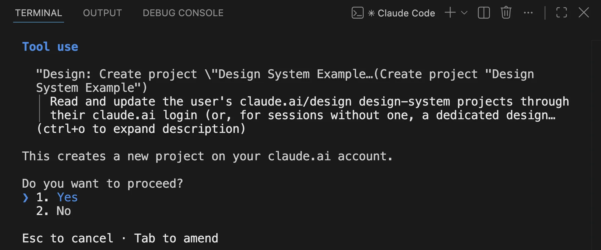
Note: The checks serve the previews from a local server and drive Chromium. If Claude Code's Bash sandbox is on, it blocks both. If the sync asks how to proceed, turn the sandbox off with /sandbox for the run (or run the capture step yourself when it offers to).
Reading the Grades
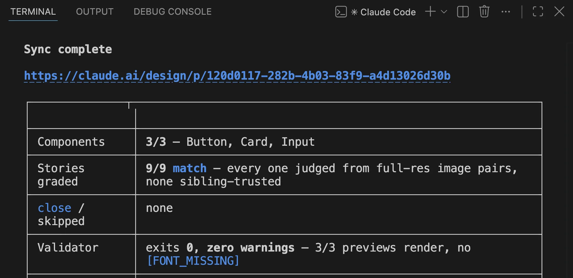
As part of the run, before anything is uploaded, Claude compares each preview against its story side by side and grades it: match, close or mismatch. It may judge only each component's primary story and trust its siblings when that one is clean, since they all go through the same pipeline. A close isn't a pass, but a sign to keep fixing. Claude fixes what it can along the way, so the grades we see at the end are what's left for us to look at.
In our run, all nine stories came back as match:
The grades are more of a diagnosis than a score, and most failures fall into one of these:
1️⃣ - Everything is unstyled
The stylesheet arrived without its tokens. Either the build command didn't run, or a token file is imported with url() instead of a string.
2️⃣ - Components look fine, but layouts collapse
The layout utilities are missing from the compiled CSS. The fix is widening the @source inline(...) block.
3️⃣ - Right shapes, wrong fonts
The fonts didn't travel. That's what the extraFonts line in our config is for.
4️⃣ - A component that looks off, but isn't
That's framing rather than styling. A dropdown, for instance, renders closed by default, which is a correct screenshot of a boring state, so the preview should point at the open story. And full-width components like Input render wider in the preview than in the Storybook canvas. Same component, different container.
That last one is exactly why we still read the grades ourselves. A grader can't tell us that a perfect screenshot is the wrong one.
The Result
Remember the hand-styled button from the intro? Now that Claude Design knows our components, let's see what it does with the same kind of request.
We'll ask it for:
A sign-in screen: a card with a title and a short description, email and password fields, a primary "Sign in" button and a secondary "Create account" button.
And here's what came back along with the code behind it:
No hand-rolled divs and no one-off utility classes. Claude reached for Card, CardHeader and Button variant="outline", and each one renders exactly like its story in Storybook. The screen Claude Design built is made entirely of our design system (meaning it's completely aligned with our product).
Beyond the Minimal Example
A fresh project with three components is the easy case. An existing design system usually lives in a bigger repo, and a few more things come up there.
Paths in a monorepo. entry needs the full path from the repo root, like packages/design-system/src/index.ts, while cssEntry stays relative to the package directory and remains a bare ds.css. Mixed bases in one config are easy to confuse, and the error just looks like a missing file.
Custom fonts. Our example needed just one font, but a real design system usually has several, with one extraFonts entry per Fontsource stylesheet. Since the paths are resolved from the package directory, in a monorepo they climb up to the root node_modules:
{
  "extraFonts": [
    "../../node_modules/@fontsource-variable/outfit/index.css",
    "../../node_modules/@fontsource/rubik/400.css"
  ]
}
A separate CSS entry. If the existing Storybook entry imports the tokens with url(), it works for Storybook but leaves a dangling import in the compiled file. The fix is a separate entry just for the sync, with a string import. Keep in mind that the two can drift apart: when the original gains a @layer base rule, the copy keeps rendering the old design and nothing complains. It's a good habit to diff them before every re-sync.
What to commit. The config, the conventions file, the separate CSS entry if there is one and NOTES.md (where the sync records what it learned, so the next run doesn't have to rediscover it) go into the repo, whereas ds.css (which we added ourselves) and everything the sync generates (dist/, ds-bundle/, .ds-sync/ and .design-sync/{sb-reference,.cache,learnings}/) go into .gitignore. The sync adds its own entries on the first run.
Wrapping Up
Today we built a minimal design system and took it into Claude Design - first by understanding how the sync works, then by syncing it step by step.
Let's sum up:
- Claude Design turns a prompt into a design, and syncing gives it our real components instead of lookalikes.
- The mirror is a compiled, self-rendering copy of the library and a one-way snapshot: nothing updates until the next
/design-sync. - Before uploading, Claude compares each preview against a reference and fixes what it can. Storybook isn't required, but it provides that reference and makes the sync verifiable.
- The sync finds components through the entry file and their type definitions, so a component missing from either never arrives.
- Storybook's preview has to load the stylesheet, or a passing grade proves nothing.
- The stylesheet is compiled with the Tailwind CLI, imports the tokens with a string
@importrather thanurl()and safelists the layout utilities Claude will write with@source inline(...). - Fonts don't travel through the CSS, so they're listed in
extraFonts. - A conventions file is the cheapest quality win: the previews show what the components look like, the conventions say how to use them.
In the end, uploading the design system is the easy part - making sure every component looks right on the other side is where the real work is.
Here's the full project with everything we built.
You’re welcome to share:
Enjoyed this post?
I’d love for you to follow me and join my newsletter.
Comments are powered by DisqusDetails
Loading comments activates Disqus, which collects information as a third-party service.
The site owner has no access to or control over the information collected by Disqus.
Related Posts

ECMAScript - Introducing Deferred Module Evaluation with import defer
8 min read
Introducing the “import defer” proposal, a new ECMAScript import form that loads and links modules eagerly while deferring their evaluation until a namespace property is first accessed - currently at stage 3 in the TC39 process.
Read post

How AI Works Under the Hood - LLMs Explained with Code
23 min read
A walkthrough of how AI works at the Large Language Model level. From tokenization and embeddings to self-attention and generation with JavaScript implementations explaining the inference pipeline.
Read post

ECMAScript - Introducing BigInt Primitive in ES2020 (ES11)
5 min read
Introducing the "BigInt" proposal, a new primitive of arbitrary precision integers, which has been reached stage 4 in the TC39 process and is included in the language specification of 2020 - the 11th edition.
Read post